Dark Mode vs Light Mode: The Most Unnecessary War in Tech History

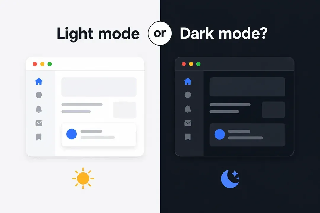
There are real problems in the world. And yet, here we are, grown adults fighting about background colors.
Dark mode versus light mode should be a settings choice. Instead, tech culture turned it into a personality test. Your theme now apparently reveals your profession, sleep schedule, eyesight, moral alignment, and whether you have ever willingly opened Discord before sunset.
The Two Tribes
Dark mode people do not merely use dark mode. They build an ecosystem.
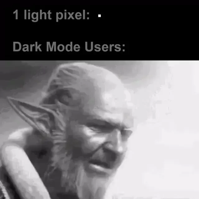
The terminal is dark. The editor is dark. The browser is dark. The wallpaper is a black rectangle with one neon line. Ask why, and the answer will involve eye health, focus, battery life, and a level of confidence normally reserved for peer-reviewed medicine.
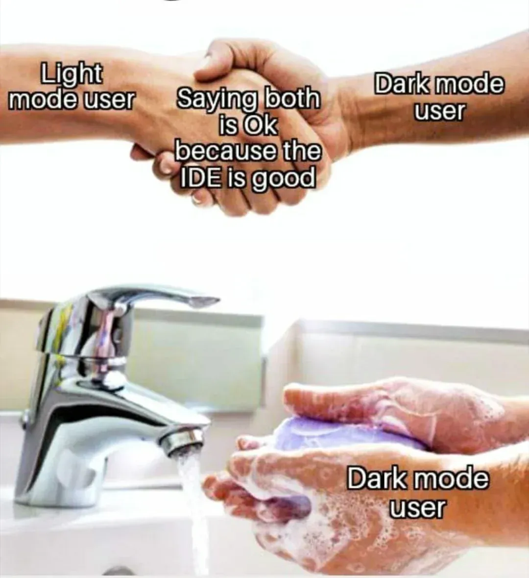
Light mode people are harder to classify. Some prefer it. Some never changed the default. Some work beside actual windows. A small but admirable group uses it specifically because dark-mode users react like someone has opened a portal to the sun.
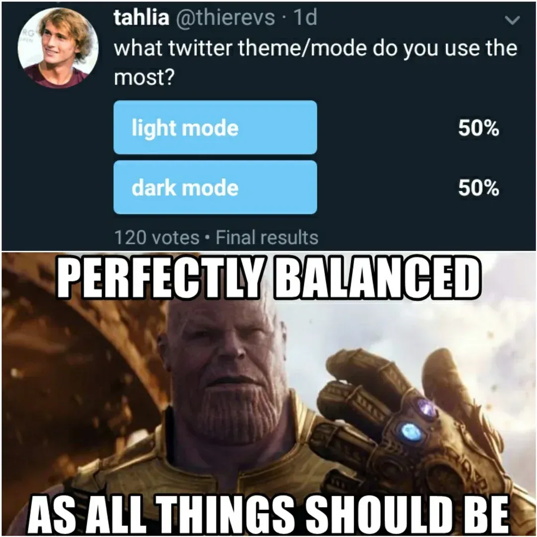
Reddit has spent years refining this argument. Dark themes are often treated as part of the developer uniform, while light themes are discussed as if they were an act of workplace aggression. Between those extremes are the switchers, who use light mode during the day and dark mode at night. They are sensible, adaptable, and therefore useless to the internet.
The Science Ruins Everyone’s Argument
Researchers call light mode positive polarity, meaning dark text on a bright background. Dark mode is negative polarity, meaning light text on a dark background.
Several controlled studies found that positive polarity can improve visual acuity and proofreading performance, especially when text is small. A bright background constricts the pupil, which can make fine details easier to resolve.
That does not mean a bright white screen at midnight is pleasant. Comfort and performance are not the same thing.
Dark mode can feel less glaring in a dim room because the interface emits less overall light. However, it is not a universal cure for eye strain. Ambient lighting, brightness, font size, contrast, viewing distance, visual conditions, and the amount of time spent staring at the display all matter.
There is also no single mode that works best for every user. Some people find white text on black backgrounds harder to read because the letters appear to glow, blur, or bleed around the edges. This effect can be more noticeable for people with astigmatism.
In other words, changing your theme is not an eye-care routine. It is one display setting.
The Battery Argument Is Real, With Fine Print
Dark mode has one clear technical victory: OLED displays.
OLED screens illuminate pixels individually. A truly black pixel can use very little power because it is effectively switched off. LCD screens rely on a backlight, so displaying a black interface does not create the same advantage.
The size of the OLED benefit depends heavily on brightness. Research by Dash and Hu found that dark mode produced relatively modest savings at common indoor brightness levels, but much larger savings when the display was near maximum brightness.
So yes, dark mode can save battery.
No, it will not transform 2 percent charge into a spiritual reserve tank.
During ordinary indoor use, lowering the brightness may be more useful than beginning another argument in the group chat.
Accessibility Is Why the Toggle Matters
The worst design choice is not light mode or dark mode. It is forcing one mode on everyone.
Some users with low vision or increased sensitivity to glare may find darker interfaces more comfortable. Others need a light background to distinguish letter shapes clearly. A theme that looks elegant to one person can be genuinely difficult for another.
Good software should offer both modes, respect the operating system preference, and remember the user's choice.
A polished dark theme also requires more work than replacing white with black. Designers need to reconsider contrast, surfaces, borders, shadows, illustrations, charts, images, form fields, and syntax highlighting. Otherwise, dark mode becomes a collection of floating grey rectangles created by someone who discovered filter: invert(1) five minutes before launch.
The Apps That Chose a Side
Some products feel inseparable from one mode.
Spotify has used a dark visual identity for so long that a bright version would feel like seeing a cinema with the lights on. Discord technically supports light mode, though internet culture treats using it as an elaborate social experiment. Code editors such as VS Code provide both options, but developer screenshots remain overwhelmingly dark.
On the other side, document editors, accounting tools, government portals, and older enterprise systems often remain bright by default. Their design philosophy seems to be that spreadsheets should resemble paper and users should resemble witnesses under interrogation.
The most frustrating apps are not the ones that choose a side. They are the ones that offer a dark theme but leave half the interface bright. Nothing builds trust like a dark dashboard followed by a full-screen white modal.
So Who Actually Wins?
Light mode generally wins for dense reading, proofreading, and small text in well-lit environments.
Dark mode wins for personal preference, low-light comfort, aesthetics, and OLED power savings.
Automatic switching wins for people who would rather use technology than join a faction.
The real winner is a well-designed interface with readable typography, sensible brightness, appropriate contrast, and a toggle that works everywhere.
The only unresolved question is Discord in light mode.
That one may require further research.
References
- 1Budiu, R. (2020). Dark Mode vs. Light Mode: Which Is Better? Nielsen Norman Group.
- 2Dash, P., & Hu, Y. C. (2021). How Much Battery Does Dark Mode Save? An Accurate OLED Display Power Profiler for Modern Smartphones. Proceedings of the 19th Annual International Conference on Mobile Systems, Applications, and Services, 323–335.
- 3Demarest, A. A. (2021). Dark mode can save battery, but only if your device has an OLED screen. Business Insider.
- 4Engst, A. (2019). The Dark Side of Dark Mode. TidBITS.
- 5Piepenbrock, C., Mayr, S., & Buchner, A. (2014). Positive Display Polarity Is Particularly Advantageous for Small Character Sizes. Human Factors, 56(5), 942–951.
- 6Piepenbrock, C., Mayr, S., & Buchner, A. (2014). Smaller pupil size and better proofreading performance with positive than with negative polarity displays. Ergonomics, 57, 1670–1677.
- 7Piepenbrock, C., Mayr, S., Mund, I., & Buchner, A. (2013). Positive display polarity is advantageous for both younger and older adults. Ergonomics, 56, 1116–1124.
- 8Sprabary, A. (2020). Is dark mode better or worse for your eyes? All About Vision.